OEE at a glance
Availability, performance, and quality in one place.
OEE84%
Availability91%
Performance88%
Quality96%
Unplanned downtime is the factory floor’s worst enemy. Our AI dashboard gives you a 48-hour warning before breakdowns happen, with visual signals your engineers can act on straight away. Why wait for a red light when the machine can already be telling you what’s wrong?

See every line in your plant, from stamping to assembly, with a dashboard that turns raw signals into clear decisions. No clutter. No hunting through spreadsheets. Just the numbers that matter.
Availability, performance, and quality in one place.
A single control view for plant managers who need the story behind the figure.
Our dashboards connect directly to PLCs, sensors, and existing historians. That means your team sees cycle times, downtime causes, and throughput trends in context. Want the short version? The data tells you where the line is slowing down, and why.
Useful, concise, and built for busy shifts.
Every metric can carry a plain-English note. Which line is drifting? Which batch needs attention? Which sensor has been noisy for three shifts? The answers are right there.
See where night shift outperforms day shift.
Compare output by shift, product family, or machine cell. The layout is compact, but the story is not. It’s a useful angle for lean reviews and daily stand-ups.
Motors, conveyors, compressors, and the awkward assets nobody talks about until they fail. Why wait for a surprise stop when the equipment already knows it’s struggling?
AI recommendation: bearing likely to fail in 38 days. Replace at the next planned maintenance window.
Stable for now, but vibration drift has increased for two consecutive shifts. Worth a closer look, isn't it?
Pressure variance and heat build-up are moving together. That pattern usually means trouble later in the week.
Healthy and within tolerance. The dashboard still watches for torque spikes, because quietly failing parts love to hide.
Temperature trend is rising during peak loads. If the pattern holds, maintenance should be booked before the next batch run.
Good performance today, with one sensor creating occasional noise. We flag it before the problem becomes a line stop.
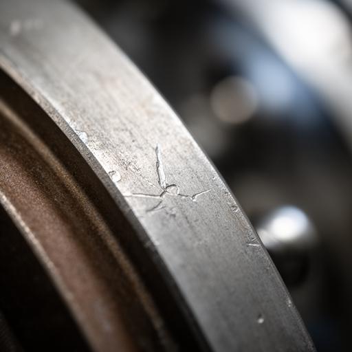
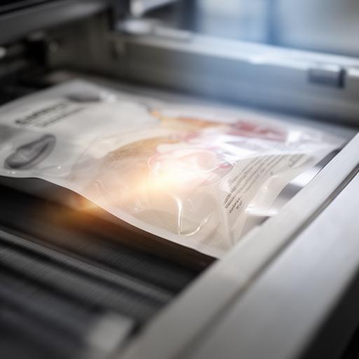
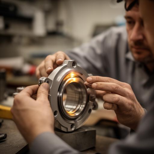
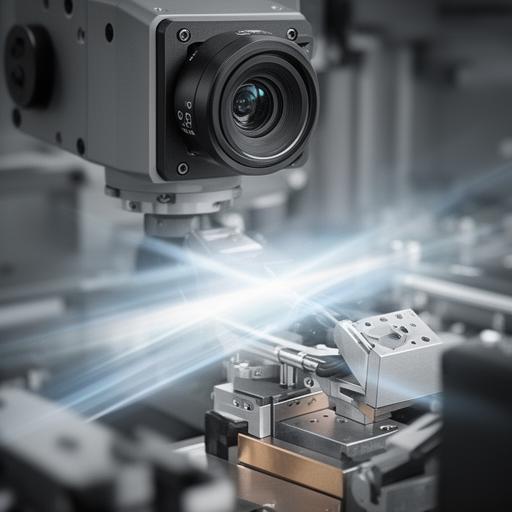
Real-time SPC charts, defect drift alerts, and image evidence that your quality team can review fast. Could manual inspection keep up with this pace?
A clear view of defect movement across each production run.
Zoomable evidence for faster root-cause checks.
The problem was familiar: repeated line interruptions, maintenance fire-fighting, and no single view of equipment health. We connected the plant’s sensors, lifted the important signals into one dashboard, and gave the team a warning window that actually changed behaviour.
What happened next? Fewer surprise stoppages, faster scheduling, and a maintenance team that could work ahead of the failure, not behind it.
640
production hours regained annually
“The dashboard took the guesswork out of maintenance. We stopped reacting and started planning.”
— Ben Hargreaves, Plant ManagerSiemens, Rockwell, Mitsubishi, Fanuc, Bosch — the stack is broad, and the deployment is tidy. The edge gateway goes in quickly, so your team can get value before the month is out.
Get a plant health score now, then decide whether your maintenance plan is working hard enough. Why keep guessing when your machines can show you the risk before it bites?